The origin of our logo
info
Date
author
share
Journal
Six years ago, when launching our digital studio, we faced a foundational challenge: we already had our name (WeMetBefore) but we needed a visual mark to grasp and translate what that name actually meant. How do you design a symbol that isn't just visually sharp, but communicates how we think, collaborate, and build?
Rather than starting with safe grid systems or traditional corporate mood boards, we went for a traditional approach: start drawing.
Go wild!
We picked up marker pens, brought color to paper, and let intuition take full control. No predefined boundaries, no rigid rules: just experimenting with strokes, hues, and spontaneous visual flow to grasp the feeling of instant alignment and connection.
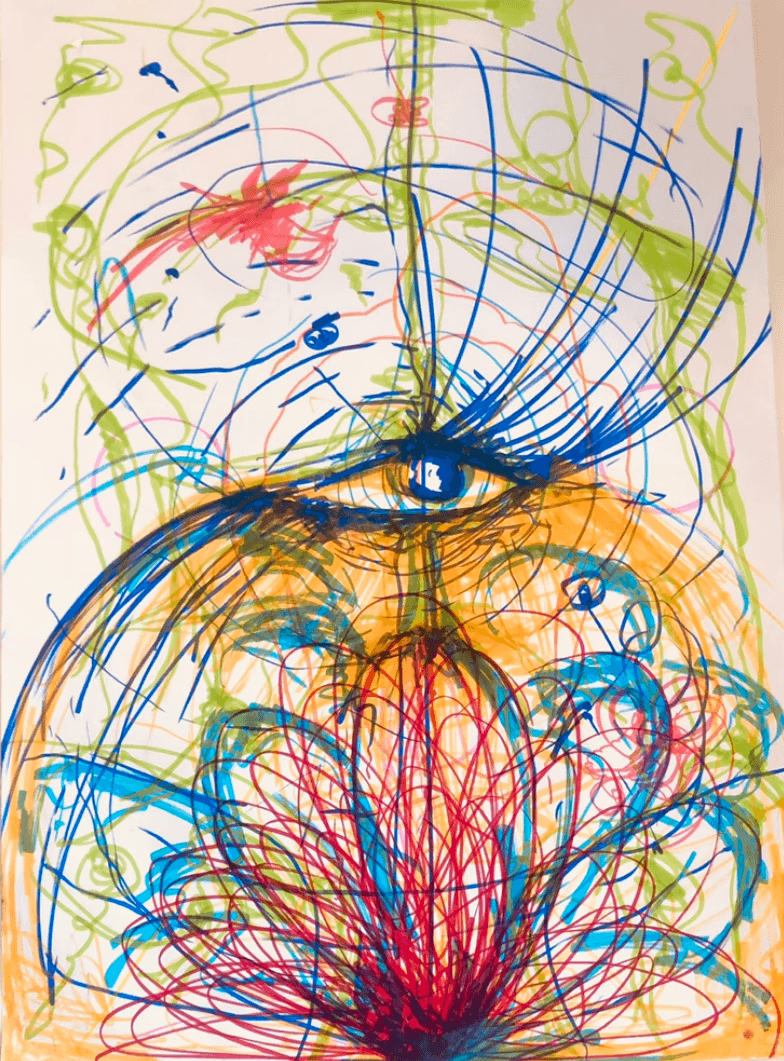
What started as an unstructured session resulted in the sketch shown in the image above. It became a raw sketch of motion, vibrant color, and a creative source.
When we come together
Looking past the initial layers of color and motion, a distinct structural pattern emerged: two human profiles facing one another, converging directly at the central core of the brain.
That central point, he focal point of deep intuition and high-level creative processing, became the anchor of our identity. It captured the exact definition of WeMetBefore: that precise moment when two separate perspectives get on the exact same wavelength, recognize a shared vision, and feel as though they've met before.
It comes down to mindset alignment: the sweet spot where domain expertise and design vision click into place.
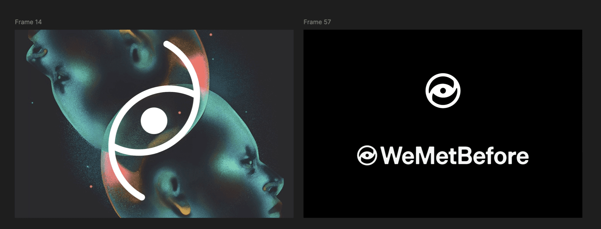
We later translated this concept into a clearer digital artwork as in the image below. For this, we worked together with Ada Zielinska, a famous artist from Poland (@zielinska.ada).

Translate it to a solid icon
The next challenge was distilling all of that raw energy and philosophical thinking into a timeless geometric mark. Make it flat, simple, a strong icon.
In the 2D logo retains the essential elements of our origin: two interlocking, crescent-like profiles converging around a clear central axis. It feels balanced, dynamic, and focused.
Make it come allive
Identity systems shouldn't remain static; they should live and move in digital space. When we designed the motion identity and website preloader, we explored what happens when you rotate the mark into the third dimension.
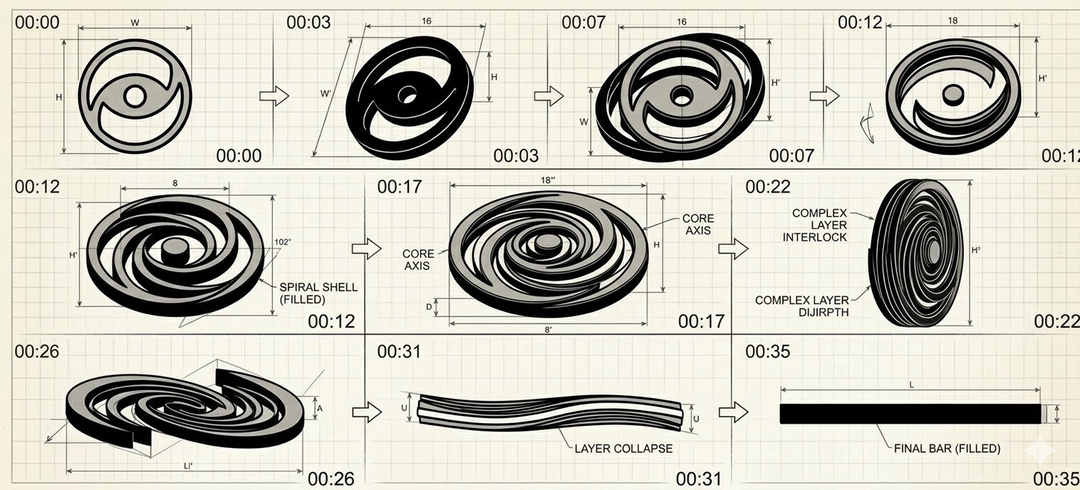
As shown in the Animations above, tilting the logo on its 3D axis reveals a hidden dimension: it becomes a galaxy on it's own. We call it The WMB Universe.
The logo today
Today this journey continues at our (new) website.
The moment you visit the site, the interactive preloader sets the tone: translating creative vision into a seamless digital experience. The circular design of the mark represents a continuous project lifecycle: a recurring process of collaboration, execution, and long-term partnership with our clients.
Four years in, it remains the foundation of how we work: trusting our process, maintaining a sharp focus on the bigger picture, and building sustainable client relationships through exceptional digital work.
❤️ Hope you enjoyed it,
Blossom


